What my experience was like as a Product Designer for Latin America's largest bank.
01 / SUMMARY
02 / Process
03 / Undestanding a lot of problems
04 / Day-to-day work: part I
05 / Day-to-day work: part II
06 / Testing the ideas
07 / Follow up
08 / Harvesting the fruits
02 / PROCESS
empathize
>
research
>
ideate
>
prototype
>
test
>
handoff
& metrics
EMPATHIZE
03 / UNDERSTANDING A LOT OF PROBLEMS
As a Product Designer, I had the privilege of working as a service provider for Itaú-Unibanco Holding, the largest bank in Latin America. I worked in various areas of the bank, including:
Human Resources;
Trade Union International Units (internationalization);
Corporate accounts;
Investments;
Payment systems: credit, debit and voucher card readers;
Payment systems: e-commerce;
Every area and product presented unique characteristics and challenges. The target demographics varied, including bank employees and financial representatives of large multinational corporations.
Although I didn't take part in the prioritization of the projects, a decision made by the Product Managers, I followed the following sequence when starting a new demand: prioritization of the project > discovery > validation of the discovery with the business > prototyping > inception > validation of the prototype with the business and technology > testing > adjustments > accessibility > handoff > monitoring of metrics and user feedback.
The day-to-day work will be detailed below.
RESEARCH & IDEATE
04 / DAY-TO-DAY WORK - PART I
At Itaú-Unibanco, the product design area is part of the IT department, and there I worked following the agile methodology, i.e. I made small deliveries starting from a minimum viable product (MVP) and evolved this product. The teams were also divided into squads and the schedules were based on sprints. Depending on the nature of the project, I also used the design sprint as a means of product development.
Once a design project had been prioritized, the first step was to understand why it was needed and what objectives and key results (OKRs) were expected. Once this data was available, the research stage began. In general, the first stages involved a lot of discovery and design critique meetings on the feature sketches. If it were still necessary, we would also move on to field research with customers. This field research could be interviews, daily monitoring of the sales team, monitoring of online feedback such as likes and comments on Google Play and the Apple Store, conversations with customer service teams, conversations with members of other squads with the same customer profile, online questionnaires, among other types of contact.
In the case of customer interviews, we contacted the statistics department to select the interviewees and avoid "professional participants", especially when they were people from outside the bank.
The tools used to carry out the surveys ranged from Google Forms to Maze, depending on the context. Once the results were obtained, they were tabulated in Excel, measured, linked to the OKRs and then the ideation and prototyping work began.


PROTOTYPE
05 / DAY-TO-DAY WORK - PART II
For prototyping, I utilized the bank's design system, which allowed for proposing new components or enhancements to existing libraries. My work encompassed internet banking interfaces, internal staff portals, payment gateways, and mobile apps and et cetera. These prototypes were shared with developers for early feedback. The primary challenge was navigating "API design" due to the legacy nature of many systems. An API, or Application Programming Interface, facilitates communication between the front-end and back-end. Often, due to time or budget constraints, it was necessary to creatively design solutions to technical issues to ensure the best customer experience with the existing system. Additionally, we suggested API improvements to eventually provide an "ideal world" experience and meet the project's OKRs and objectives to the greatest extent possible.
Furthermore, the prototypes adhered to the brand's tone and accessibility standards, ensuring that a bank serving over 100 million customers remains comprehensible to all.
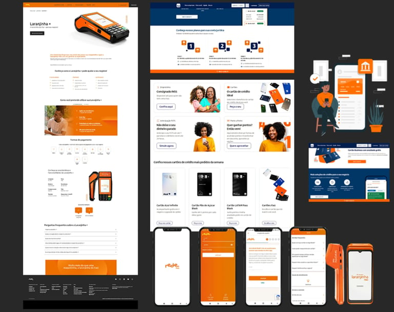
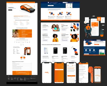
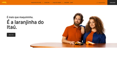
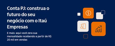
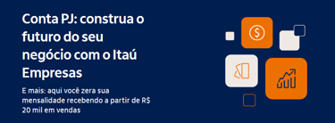
Note: due to the nature of the client and the work, I'm not allowed to show internal interfaces or prototypes. However, here is a sample of the public portals of Rede (means of payment) and Itaú Empresas.
I have experienced usability testing both in-person and remotely, with the 2020 pandemic shifting much of the in-person work to remote formats. Typically, face-to-face tests involved using a navigable prototype on a computer or smartphone within a mirrored room, where I could serve as both observer and moderator. Conversely, remote tests were conducted either asynchronously through Maze or synchronously with access and screen sharing via Microsoft Teams.
After the tests were conducted, the results analyzed, and necessary adjustments applied, the project progressed to the accessibility and front-end development phases.
When the code was relatively functional, the last test was carried out, the accessibility test, in which a blind or low-vision user was invited to navigate the project's screens using assistance tools. In fact, one of the projects I was able to work on, Sales Cancellation, in the area of payment systems, was recognized as the most accessible project of 2021, which made me very proud!
TEST
06 / TESTING THE IDEAS
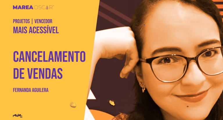
The most affordable project recognition flyer for 2022.
Once the project has been validated and meets all expectations, it is put into production. I also took part in approval processes, back-testing with QA, the Product Manager and front-end developers.
Once the product was in production, the metrics stage began. At this stage, I monitored the project and thought about possible improvements and updates. I wasn't able to take part in this stage in every project. Often, team relocations, deprioritizations or changes in scope meant that I would get as far as the project documentation stage and pass the work on to the next designer to follow up. And a well-launched product can bear good fruit, as happened again with the Sales Cancellation case.
HANDOFF & METRICS
07 / FOLLOW UP
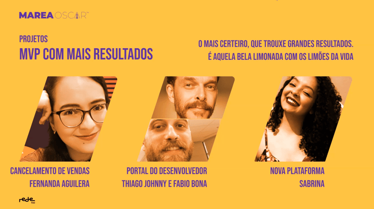

In the top three MVPs with the most results, Sales Cancellation solved 70% of the needs reported to the call center. (2022)
Learnings
Working at the largest bank in Latin America provided a wide array of experiences, from engaging in design thinking methodologies like brainstorming, workshops, double-diamond processes, design sprints, to acquiring significant knowledge in the financial business sector.
It also presented the chance to work with exceptional individuals, engage in mentorship, glean process insights, share meals with directors, and even have coffee with the CEO.
This section will not cover the topic of next steps, as tomorrow is a box full of surprises!
THANK YOU!
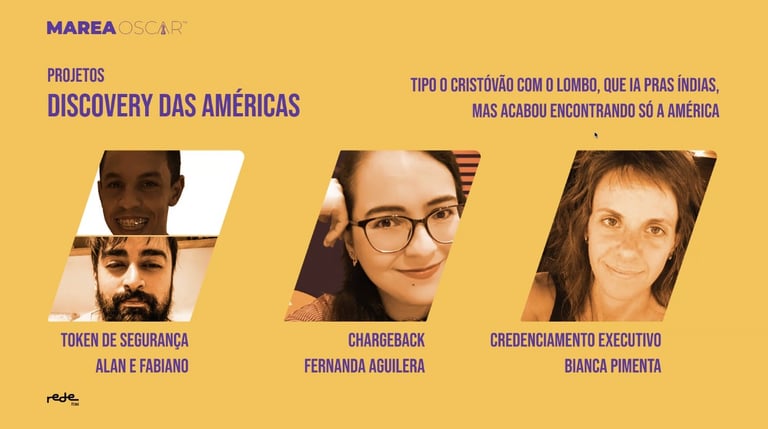
The Chargeback project was in the Top 3 projects with the most complete discovery, which helped prioritize which features would go into the MVP. (2022)
RESULTS
08 / HARVESTING THE FRUITS
The downside of working on a project basis in a company full of processes is that almost all the time we don't spend enough time in the squads to monitor the results of the projects. As soon as the design stage is over, we move on to the next challenge, and the Product Owner is responsible for monitoring the results. But throughout my time at the bank, some of the many results obtained were:
Human Resources
Greater agility in the vacation scheduling process, which reduced the time it took team managers to authorize vacations for their subordinates.
Greater ease and autonomy in performance evaluation questionnaires. ease of filling in electronic time sheets.
Self-service in the health insurance contracting flow.
Self-service in the compliance data flow.
Trade Union International Units (internationalization)
Self-service registration of employees in International Units.
Increase in the completion of performance appraisals.
53% increase in reports delivered on time.
Greater agility in searching for service logs.
Corporate accounts
Reduction in calls about filling out payrolls and payments.
50% reduction in errors when filling in legal demands and contracts.
30% reduction in the time taken to fill out contracts for services to rural producers
Payment Systems
Average maintenance visit time reduced by 40%.
70% of sales cancellation center needs met.
Payment systems: e-commerce.
Improved accessibility of the portal.
Creation of APIs and customized interfaces for VIP clients.
